The Banker rebrand
challenge.
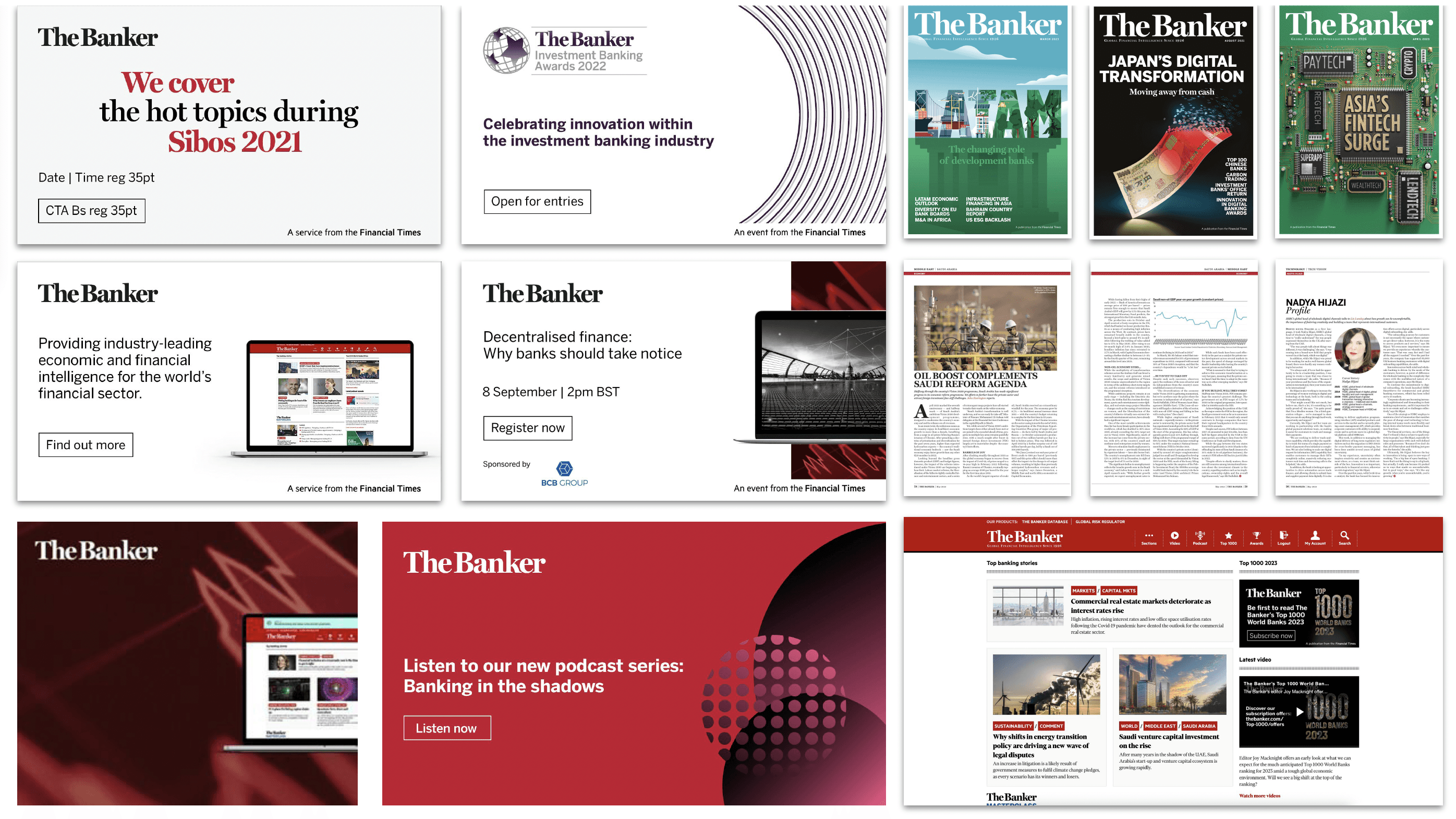
The existing brand had a number of limitations. The colour palette was restrictive, the logo wasn’t optimised for digital, and there were inconsistencies across channels. As a result, The Banker struggled to feel relevant in a more digital-first environment while maintaining a strong, cohesive identity.
Alongside the rebrand, we also needed to rethink the cover approach. The existing model relied heavily on externally commissioned artwork, which was often time-consuming and not always aligned with the final editorial angle.
solution.
The rebrand focused on simplifying and strengthening the system, improving both digital performance and editorial efficiency.
— The logo was refined to improve legibility in digital formats, while preserving its heritage serif style and introducing the signature Banker Red
— I introduced a new art direction for covers, shifting towards more conceptual, idea-led visuals that aligned more closely with editorial content
— I worked closely with the product team to guide branding and typography, ensuring the website aligned with the wider design system
— I led the team in rolling out the rebrand across social, video, podcasts, email and house ads, ensuring consistency across all touchpoints
Rather than bringing production in-house, we evolved the approach by redefining how we worked with external illustrators. I established a clearer creative direction and worked with a curated roster of artists to deliver more consistent, concept-driven covers, improving both the quality of the work and its alignment with the editorial narrative.
The work was also recognised externally, being shortlisted for Transformation Initiative of the Year at the NMAs 2024.
The rebrand focused on simplifying and strengthening the system, improving both digital performance and editorial efficiency.
— The logo was refined to improve legibility in digital formats, while preserving its heritage serif style and introducing the signature Banker Red
— I introduced a new art direction for covers, shifting towards more conceptual, idea-led visuals that aligned more closely with editorial content
— I worked closely with the product team to guide branding and typography, ensuring the website aligned with the wider design system
— I led the team in rolling out the rebrand across social, video, podcasts, email and house ads, ensuring consistency across all touchpoints
Rather than bringing production in-house, we evolved the approach by redefining how we worked with external illustrators. I established a clearer creative direction and worked with a curated roster of artists to deliver more consistent, concept-driven covers, improving both the quality of the work and its alignment with the editorial narrative.
